
Everybody knows the cheap house in the good suburb is cheap for a reason. In Brisbane, the reason is usually water. A few weeks ago, in the comments under my post on which price brackets are cutting first, several readers said the same thing in different words: if it is in budget, it flooded. One of them expected 30% off anything flood affected. I believed that too. I just never counted it.
So I counted it. Every house sold in the Brisbane City Council area since 1 January 2025, each address checked against the council's Flood Awareness Map. This post is what I found, and more usefully, what you can do with the number before you make an offer.
What I counted
- 16,847 house sales in Brisbane City Council postcodes 4000 to 4179, sold between 1 January 2025 and 5 September 2026, as recorded on 12 September 2026. Houses only, no units, no townhouses.
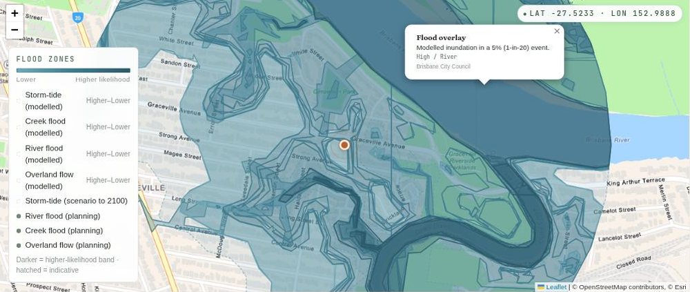
- On the map means the address touches the council's Flood Awareness Map at Medium or High likelihood for river, creek or storm tide (the bay coming in). In the council's own words, High is a 1 in 20 chance in any year, Medium is 1 in 100.
- Off the map means the address has no river, creek or storm tide band at all. Addresses in the Low and Very Low bands (1 in 500 and 1 in 2000) sit in neither pile, so the two sides stay clean.
- Overland flow is left out on purpose. It sits on a huge share of Brisbane blocks at Low and would swallow the whole comparison. So a few houses I call off the map will still show overland flow shading when you look them up on the council map.
- 917 of the 16,847 sales are on the map. About 1 in 18. 350 of those are in the High band.
Same suburb, the mapped side sells for 14% less
The only fair comparison is inside a suburb. Compare a mapped house in Oxley against an unmapped house in Ascot and you have measured Ascot, not the water. So I only compared suburbs with at least 8 sales on each side. 33 suburbs made it.
In 29 of the 33, the mapped side sold for less. The middle suburb, 14% less, measured against the median of the same suburb off the map. In money, the middle gap is $207,500. 12 suburbs are 25% or more under.
| Suburb | On the map: sales | Median on the map | Off the map: sales | Median off the map | Gap | Gap in money |
|---|---|---|---|---|---|---|
| Indooroopilly | 21 | $1,210,000 | 109 | $2,250,000 | -46% | -$1,040,000 |
| Auchenflower | 12 | $1,375,000 | 40 | $2,312,500 | -41% | -$937,500 |
| Sherwood | 13 | $1,300,000 | 43 | $2,150,000 | -40% | -$850,000 |
| Clayfield | 16 | $1,295,000 | 124 | $2,100,000 | -38% | -$805,000 |
| Corinda | 18 | $1,057,125 | 52 | $1,662,500 | -36% | -$605,375 |
| Graceville | 38 | $1,267,650 | 16 | $1,990,000 | -36% | -$722,350 |
| Paddington | 8 | $1,420,000 | 154 | $2,117,500 | -33% | -$697,500 |
| Darra | 8 | $741,444 | 39 | $1,100,000 | -33% | -$358,556 |
| Woolloongabba | 12 | $1,248,750 | 26 | $1,770,125 | -29% | -$521,375 |
| Windsor | 22 | $1,295,000 | 51 | $1,830,000 | -29% | -$535,000 |
| Carina | 14 | $1,050,000 | 164 | $1,405,000 | -25% | -$355,000 |
| Oxley | 37 | $859,000 | 76 | $1,147,500 | -25% | -$288,500 |
| Albion | 10 | $1,205,000 | 15 | $1,590,000 | -24% | -$385,000 |
| Jindalee | 25 | $1,007,500 | 42 | $1,240,000 | -19% | -$232,500 |
| West End | 10 | $1,865,000 | 32 | $2,175,000 | -14% | -$310,000 |
| Hemmant | 13 | $950,000 | 51 | $1,105,000 | -14% | -$155,000 |
| New Farm | 14 | $3,312,500 | 38 | $3,850,000 | -14% | -$537,500 |
| Morningside | 10 | $1,450,500 | 165 | $1,658,000 | -13% | -$207,500 |
| Wynnum West | 11 | $1,050,000 | 210 | $1,200,000 | -13% | -$150,000 |
| Tingalpa | 14 | $1,055,000 | 98 | $1,200,000 | -12% | -$145,000 |
| Norman Park | 12 | $1,612,500 | 90 | $1,812,500 | -11% | -$200,000 |
| Kenmore | 14 | $1,317,500 | 158 | $1,450,000 | -9% | -$132,500 |
| Lota | 12 | $1,242,500 | 45 | $1,330,000 | -7% | -$87,500 |
| Fig Tree Pocket | 13 | $2,010,000 | 48 | $2,135,000 | -6% | -$125,000 |
| Deagon | 12 | $1,012,500 | 39 | $1,070,000 | -5% | -$57,500 |
| Yeronga | 38 | $1,859,444 | 26 | $1,910,000 | -3% | -$50,556 |
| The Gap | 10 | $1,385,000 | 301 | $1,415,000 | -2% | -$30,000 |
| Bulimba | 23 | $2,325,000 | 55 | $2,350,000 | -1% | -$25,000 |
| Ashgrove | 19 | $1,944,390 | 208 | $1,955,000 | -1% | -$10,610 |
| Brighton | 60 | $1,281,000 | 181 | $1,205,000 | +6% | +$76,000 |
| Sandgate | 24 | $1,507,500 | 19 | $1,350,000 | +12% | +$157,500 |
| Hawthorne | 9 | $2,600,000 | 51 | $2,200,000 | +18% | +$400,000 |
| Wynnum | 19 | $2,200,000 | 256 | $1,344,500 | +64% | +$855,500 |
Coverage: house sales in Brisbane City Council postcodes 4000 to 4179, sold 1 January 2025 to 5 September 2026, as recorded on 12 September 2026. Recent months are still filling in, so sale counts for July and August 2026 will rise.
Medians of sold prices. Not the same house on both sides, so read the shape, not the decimals.
Two famous flood suburbs are missing from that table and it is worth saying why. Chelmer had 47 house sales in the window and 33 of them are on the map at Medium or High. Of the other 14, 13 sit at Low or Very Low and 1 is off the map. Rocklea, 40 of 43 on the map and none off it. There is nothing to compare against. The map is the suburb.
Readers also asked about East Brisbane, Nundah and Northgate. Under these rules they have 7, 5 and 3 house sales on the map at Medium or High, short of the 8 I need, so no number from me on those three.
14% is the middle. The river suburbs are nowhere near the middle
When I put an early cut of this in front of a few thousand Brisbane locals on 6 September, one reader asked whether I meant the gap is still 15%, just 15% of a bigger number. Fair question, I wrote it badly. No. The western river suburbs are not at the middle at all, they sit at 2 to 3 times the middle.
Indooroopilly, 46% under, $1,040,000. Auchenflower 41%. Sherwood 40%. Clayfield 38%. Corinda and Graceville 36%. So it is a bigger share of a bigger number, and in dollars the gap runs from about $600,000 to just over $1,000,000. At the top end, that is close to a whole second house in Oxley.
That earlier cut said 15%. This one says 14%, because between the two I kept only suburbs inside Brisbane City Council (the first cut let in a slice of Logan and Redland) and fenced every suburb by postcode (there is a West End in Townsville too). I also removed duplicate records of the same sale, including one source that mostly posts round asking-price figures weeks ahead of the real sale. Put together, the changes took the gap down, not up. Same rules from here.
The discount you can see, and the bill you cannot
The best question I got on that early cut was about insurance. How much of the discount is just twenty years of flood cover, already baked into the price?
Honestly, we cannot see insurance in our data at all. Nobody can, a premium is not a public record. What I can tell you is what I have seen with my own quotes. I have typed flood-mapped Brisbane addresses into a few insurers' websites myself, and $10,000 a year is common, $20,000 to $30,000 is what I see most, and it goes up hard after a flood. That is my own experience, not my database, so treat it as one person's quotes and go get your own.
The premium is like a subscription to live there. You pay it every year and you never get it back. The discount is different. You pay less on the way in, and unless the gap closes while you own the place, you sell into the same gap on the way out. The discount is not money in your pocket. It is money you did not have to borrow.
How many years of flood cover the discount buys
So here is the sum worth doing before an offer. Take the gap in your suburb, divide it by the premium you were quoted, and that is how many years of cover the discount pays for. Once those years are up, the water is costing you more than the market ever took off.
| Suburb | Gap in money | Years at $10,000 a year | Years at $20,000 | Years at $30,000 |
|---|---|---|---|---|
| Indooroopilly | $1,040,000 | 104 | 52 | 35 |
| Graceville | $722,350 | 72 | 36 | 24 |
| Woolloongabba | $521,375 | 52 | 26 | 17 |
| West End | $310,000 | 31 | 16 | 10 |
| Oxley | $288,500 | 29 | 14 | 10 |
| Kenmore | $132,500 | 13 | 7 | 4 |
| Middle of the 29 suburbs that discount | $288,500 | 29 | 14 | 10 |
Coverage: the gap column comes from the suburb table above (house sales 1 January 2025 to 5 September 2026). The three premium columns are worked examples, not data. Replace them with your own quote.
Read it like this. On the western bend, a $20,000 premium can be seen as already baked into the discount you get. The gap there is $722,350 in Graceville and $1,040,000 in Indooroopilly, so the market has priced the water in, and then some. In Oxley or Kenmore the same premium eats the discount in 7 to 14 years, and most people own a house longer than that.
One more thing the quote does that the map cannot. Most lenders make building insurance a condition of settlement, and a big premium comes off your borrowing power in their sums. So the quote is not only a cost to weigh, it can decide whether the loan gets approved at all. And lenders do not agree with each other on this, the same address can be fine at one bank and a problem at the next. Get the quote before the offer, from more than one insurer, and tell your broker the band.
Right on the water, the discount mostly disappears
Then the surprise. In 4 of the 33 suburbs the mapped side sold for more. Wynnum is $2,200,000 on the map against $1,344,500 off it, 64% dearer. Hawthorne 18% (only 9 mapped sales, so hold it loosely). Brighton 6%, Sandgate 12%.
That is the waterfront. In Wynnum, 17 of the 19 mapped sales touch the storm tide layer, which is the bayfront. In Brighton it is 58 of 60, Sandgate 23 of 24. On the bay and along the river the flood map is basically a map of who has the view. The water that floods you is the same water you paid extra to look at.
Not every bay suburb flips though. In Lota all 12 mapped sales touch the storm tide band and they still sold 7% under the houses off the map. Deagon, 10 of its 12 on storm tide, 5% under. On the bay the discount shrinks, it does not always turn into a premium.
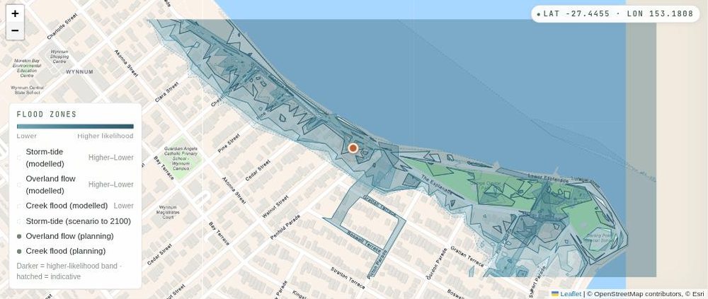
A reader who lives in Brighton had a theory for why the mapped side sells higher there. Their read was that the blocks by the water are the big original ones that were never split up, and that most people in Brighton want to live near the water anyway. The second half checks out. The first half does not.
Brighton's mapped side is really two different places. The bayfront strip, storm tide only, is 14 house sales at a median of $1,568,000, on a median block of 589 square metres. The lower ground where the creek and storm tide bands overlap is 44 sales at $1,250,000 on 407 square metres. The houses with no band at all sold for $1,205,000 on 607 square metres. So the mapped blocks are not the big ones. On the bayfront they are about the same size, and where the two bands overlap they are smaller. What people pay extra for on the bayfront is the water, not the land.
The river does the same thing in places. A reader asked about Yeronga, which sits near level in the table, 3% under. The four dearest house sales in the whole suburb are all on Brisbane Corso, right on the river, and all four are on the map. Take the Corso out and the rest of Yeronga's mapped side drops to a median of $1,737,500 against $1,910,000 off the map, 9% under. So Yeronga does price in the water. A chunk of its flood map just happens to be its dearest street.
The point for a buyer is uncomfortable. On the Wynnum, Brighton or Sandgate bayfront you pay the view premium and the insurance premium, and the flood map takes nothing off. Nothing wrong with that, as long as you know which one you are paying for.
High and Medium do not sell the same
The map has bands and the price follows them. Citywide, a 3-bedroom house in the High band (1 in 20) sold for a median of $1,117,500, 10% under the $1,240,000 median for 3-bedders off the map. Medium (1 in 100), a median of $1,160,000, 6% under. So "on the flood map" is two different discounts wearing one label. Ask which band, not just whether.
For 4 and 5-bedroom houses the citywide discount disappears, the mapped side is even a little dearer. 4-bedders on the map, a median of $1,480,000. Off it, $1,450,000. That is not the water being free. That is the Medium and High bands running through Brisbane's dearest dirt (Yeronga, Chelmer, Graceville, Bulimba, Sandgate) and the bayfront pulling the number up. Which is exactly why the only figure to trust is the same-suburb one.
Tennyson, where the whole suburb is on the map
A reader in Tennyson asked about their suburb. They find it an odd market, where some houses that have flooded before still sell well and others sit for a long time. I had not looked at Tennyson until then, and it turned out to be the strangest one in the file.
Since January 2025 there are 18 house sales in Tennyson, and every one of them touches the river map at some level. Nine sit at Medium or High, median $1,600,000. The other nine sit at Low or Very Low, median $1,850,000. So in Tennyson the comparison is Medium or High against Low or Very Low, because there is nothing off the map to compare with. That is 13.5% apart, $250,000. But the two sides overlap a lot. The cheapest house sold in the suburb is on the Low side, and the dearest is in the Very Low band.
In that discussion I said the cheapest one was off the map. It is not, it is in the Low band. There is no off-map Tennyson. That is the correction, and it is also the point: in a suburb like that the band is not the story, the house is.
What is for sale on the map right now
As at 12 September 2026, 2,746 Brisbane houses are advertised for sale, and 180 of them sit at Medium or High, about 1 in 15. Compared with the rest they are a bit more likely to show a price (50% hide it, against 63% for houses off the map, and why so many hide it is its own post). They also ask less in the middle, a median $1,250,000 against $1,399,000 among the ones that show a price, and have been up longer, a median 60 days since I first saw them against 51.
One honest gap in that count. About 1 in 9 advertisements in the same area have no property type recorded yet, and those 362 are not in it. The shape holds, the exact count is a floor.
What I cannot untangle
- The mapped side is usually the low side as well. Further from the ridge, no view. I cannot split "floods" from "at the bottom of the hill" with the data I have. Some of the discount is just gravity.
- The map is modelled, not history. The council says so itself, and it does not show depth or speed of water. A High band means a 1 in 20 chance in any year. It does not mean the house went under in 2022, and a house off the map might have. And I tag every sale with the council map as I hold it now, loaded in April 2026, not the map the buyer looked at on the day.
- Insurance is invisible to us. See above.
- Recent months are still filling in. Our sales records for July and August 2026 are thinner than they will be in a few months, so nothing here is a trend.
- In 14 of the 33 suburbs the mapped side is also the smaller-house side (the middle house has fewer bedrooms, usually 3 against 4). I reran it 3-bed against 3-bed: Clayfield 39% under, Corinda 26%, Indooroopilly 25%, Carina 24%, Windsor 22%, Oxley 21%. Thinner samples, same direction.
What to do before you make an offer
- Type the address into the council's Flood Awareness Map, or the free flood check here. Get the band, not just a yes or no.
- Get an insurance quote before the offer, not after. Online, ten minutes, more than one insurer. If nobody will quote, that is your answer.
- Do the years sum. Suburb gap divided by the annual premium, compared with how long you plan to hold.
- Council's FloodWise Property Report is free and gives the flood levels for the lot, which the map on its own does not. Read it before the building inspection, not after.
- Be ready for the bank's valuer to come in under your price on a mapped house. The bank lends on their number, not yours, so the deposit can grow at the last minute. Ask your broker which lenders are relaxed about the band before you sign anything.
- On the bayfront, do not expect a discount. Decide whether the view is worth the premium.
- If it is a mapped house that has been advertised a while, the price may have give in it. Those houses show their price more often and sit longer.
How this was counted
- My own tracking of Brisbane sales, crossed against Brisbane City Council's Flood Awareness Map likelihood layers for river, creek and storm tide. Overland flow left out.
- Houses only, 179 suburbs in postcodes 4000 to 4179, sold 1 January 2025 to 5 September 2026. Duplicate records of the same sale removed, including one source whose prices are mostly round asking-price figures posted weeks before the real sale record. Unit-style addresses removed.
- A suburb is only in the table with 8 or more sales on each side. 111 suburbs had at least one mapped sale, 72 of them had fewer than 8, and 6 more had 8 mapped sales but fewer than 8 off the map.
- Medians of sold prices. Not the same house on both sides.
- Some suburb numbers I typed into that discussion counted overland flow as well, so a few of them (West End, Yeronga, East Brisbane) differ a little from the ones here. The numbers in this post follow the rules above.
- Numbers are as recorded on 12 September 2026. The earlier street-level view of the same council map is in Brisbane's worst flood-risk streets, which counts addresses, not sales, so the two posts are not comparable number for number.
Questions people ask
Do houses in Brisbane flood zones sell for less?
Inside the same suburb, usually yes. Across the 33 Brisbane suburbs with enough sales to compare, the side on the council flood map at Medium or High likelihood sold for 14% less in the middle, and 29 of the 33 were cheaper on the mapped side. In Wynnum, Brighton and Sandgate on the bay, the mapped side sold for more.
How much less is a flood-zone house in Brisbane worth?
It depends on the suburb far more than on the map. Western river suburbs 36% to 46% under, Oxley 25%, Kenmore 9%, Wynnum 64% dearer. In money, the middle gap across the 33 suburbs is $207,500. Sales from 1 January 2025 to 5 September 2026.
Does flood insurance cancel out the discount?
It can. The discount is a one-off and the premium is every year, so divide the suburb gap by your quote. At $20,000 a year, a $288,500 gap (Oxley) is about 14 years of cover, and a $1,040,000 gap (Indooroopilly) is about 52. Our data does not hold premiums, so the quote has to be yours.
Does being on the flood map mean the house has flooded?
No. The council map is modelled likelihood, not a record of past floods, and it does not show depth or speed of water. High is a 1 in 20 chance in any year, Medium 1 in 100, Low 1 in 500, Very Low 1 in 2000.